A megamenu is an expandable menu in which multiple options are displayed in a two-dimensional drop-down layout. It’s useful for navigating websites with lots of options or complex structures. In this mega menu tutorial, we’ll walk you through the steps of creating a responsive mega menu title using HTML, CSS, and some JavaScript.
Table of Contents
What is a mega menu?
Definition and purpose:
- Enhance site navigation by grouping related links and categories together.
- Improve user experience by reducing the number of clicks required to find specific content.
- Provide a visually appealing way to display options.
Benefits of using mega menu
Improved user experience:
- Easy to navigate: Large menus allow users to quickly see all available options without having to navigate through multiple drop-down menus.
- Visual appeal: The use of images, icons, and multiple columns makes it easier for users to find what they are looking for.
Better organization:
- Hierarchical structure: Mega menu can organize a large number of links in a structured hierarchical format to make the website appear more organized.
- Group related items: Related items can be grouped together to provide context and relevance to users.
Increase engagement:
- Showcase key content: Large menus can highlight important content or products and draw users’ attention to key areas of your site.
- Interactive elements: Including interactive elements such as images and videos can engage users and keep them on the site longer.
Advantages of Search Engine Optimization:
- Improved internal linking: By linking to individual pages within a mega menu, a website can improve its internal linking structure, which benefits SEO.
Examples of websites using super menus
Amazon:
Nike:
Walmart:
Below is the HTML code for a responsive megamenu. We’ll break down each part to understand how it works.
HTML structure
The HTML structure consists of a nav element with a container div, which houses the logo and the main menu.
<header>
<nav>
<div class="container">
<div class="row">
<div class="logo">
<a href="#">Mega Menu</a>
</div>
<div class="mobile_btn">
<i class="fas fa-bars"></i>
</div>
<div class="main_menu">
<ul>
<li><a href="#" class="active">Home</a></li>
<li class="has_dropdown">
<a href="#">Pages <i class="fas fa-angle-down"></i></a>
<ul class="sub_menu">
<li><a href="#">Page 1</a></li>
<li class="has_dropdown">
<a href="#">Page 2 <i class="fas fa-angle-right"></i></a>
<ul class="sub_menu">
<li><a href="#">Page 2.1</a></li>
<li><a href="#">Page 2.2</a></li>
<li class="has_dropdown">
<a href="#">Page 2.3 <i class="fas fa-angle-right"></i></a>
<ul class="sub_menu">
<li><a href="#">Page 2.1</a></li>
<li><a href="#">Page 2.2</a></li>
<li><a href="#">Page 2.3</a></li>
<li><a href="#">Page 2.4</a></li>
</ul>
</li>
<li><a href="#">Page 2.4</a></li>
</ul>
</li>
<li><a href="#">Page 3</a></li>
<li><a href="#">Page 4</a></li>
</ul>
</li>
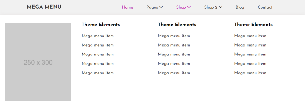
<li class="mega_menu_dropdown has_dropdown">
<a href="#">Shop <i class="fas fa-angle-down"></i></a>
<div class="mega_menu sub_menu">
<div class="mega_menu_item">
<img decoding="async" src="https://via.placeholder.com/250x300" alt="Mega Menu Tutorial: Creating a Responsive Mega Menu Header #2" title="Mega Menu Tutorial: Creating a Responsive Mega Menu Header #2">
</div>
<div class="mega_menu_item">
<h3>Theme Elements</h3>
<a href="#">Mega menu item</a>
<a href="#">Mega menu item</a>
<a href="#">Mega menu item</a>
<a href="#">Mega menu item</a>
<a href="#">Mega menu item</a>
</div>
<div class="mega_menu_item">
<h3>Theme Elements</h3>
<a href="#">Mega menu item</a>
<a href="#">Mega menu item</a>
<a href="#">Mega menu item</a>
<a href="#">Mega menu item</a>
<a href="#">Mega menu item</a>
</div>
<div class="mega_menu_item">
<h3>Theme Elements</h3>
<a href="#">Mega menu item</a>
<a href="#">Mega menu item</a>
<a href="#">Mega menu item</a>
<a href="#">Mega menu item</a>
<a href="#">Mega menu item</a>
</div>
</div>
</li>
<li class="mega_menu_dropdown mega_menu_demo_2 has_dropdown">
<a href="#">Shop 2 <i class="fas fa-angle-down"></i></a>
<div class="mega_menu sub_menu">
<div class="mega_menu_item">
<img decoding="async" src="https://via.placeholder.com/250x300" alt="Mega Menu Tutorial: Creating a Responsive Mega Menu Header #2" title="Mega Menu Tutorial: Creating a Responsive Mega Menu Header #2">
</div>
<div class="mega_menu_item">
<h3>Theme Elements</h3>
<a href="#">Mega menu item</a>
<a href="#">Mega menu item</a>
<a href="#">Mega menu item</a>
<a href="#">Mega menu item</a>
<a href="#">Mega menu item</a>
</div>
<div class="mega_menu_item">
<h3>Theme Elements</h3>
<a href="#">Mega menu item</a>
<a href="#">Mega menu item</a>
<a href="#">Mega menu item</a>
<a href="#">Mega menu item</a>
<a href="#">Mega menu item</a>
</div>
<div class="mega_menu_item">
<h3>Theme Elements</h3>
<a href="#">Mega menu item</a>
<a href="#">Mega menu item</a>
<a href="#">Mega menu item</a>
<a href="#">Mega menu item</a>
<a href="#">Mega menu item</a>
</div>
</div>
</li>
<li><a href="#">Blog</a></li>
<li><a href="#">Contact</a></li>
</ul>
</div>
</div>
</div>
</nav>
</header>
CSS Styling
The CSS code styles the mega menu and its subcomponents. It includes media queries to ensure responsiveness across different screen sizes.
					:root {
    --background-color: #f1f1f1;
    --hover-color: rgb(189, 10, 174);
}
* {
    margin: 0;
    padding: 0;
    box-sizing: border-box;
    outline: 0;
}
a {
    text-decoration: none;
}
ul,
ol {
    list-style-type: none;
}
body {
    overflow-x: hidden;
    font-family: "Josefin Sans", sans-serif;
}
.container {
    width: 1140px;
    margin: 0 auto;
}
.row {
    display: flex;
    flex-wrap: wrap;
    justify-content: space-between;
    align-items: center;
}
nav {
    background: var(--background-color);
    box-shadow: 0px 5px 15px 0px rgba(212, 201, 201, 0.75);
}
.logo a {
    font-size: 20px;
    font-weight: 700;
    color: #353535;
    text-transform: uppercase;
}

/* normal menu css */

.main_menu > ul > li {
    display: inline-block;
    position: relative;
    margin: 0 -2px;
}
.main_menu ul li {
    position: relative;
}

.main_menu ul li a {
    font-size: 16px;
    color: #353535;
    padding: 20px 25px;
    display: block;
    font-weight: 400;
}

.main_menu ul li .active,
.main_menu ul li:hover > a {
    color: var(--hover-color);
}
/* Normal Dropdown menu */
.main_menu ul li ul {
    width: 200px;
    background: #fff;
    transition: 0.5s;
    box-shadow: 0px 5px 15px 0px rgba(212, 201, 201, 0.75);
}

.main_menu ul li ul li a {
    padding: 10px 25px;
    font-size: 15px;
}
.main_menu ul li ul li a i {
    float: right;
}

.main_menu ul li ul li ul {
    left: 100%;
    top: 0;
}

/* mega menu css */
.mega_menu_dropdown {
    position: static !important;
}
.mega_menu {
    left: 0;
    right: 0;
    background: #fff;
    display: flex;
    flex-wrap: wrap;
    transition: 0.5s;
    box-shadow: 0px 5px 15px 0px rgba(212, 201, 201, 0.75);
}
.mega_menu_item {
    width: 25%;
    padding: 30px 20px;
}
.main_menu ul li .mega_menu_item a {
    padding: 10px 0;
}

.main_menu ul li .mega_menu_item a:hover {
    color: var(--hover-color);
}
.mega_menu_item h3 {
    margin-bottom: 15px;
}
.mega_menu_item img {
    width: 100%;
}

/* demo_2 css */
.mega_menu_demo_2 .mega_menu {
    left: 50%;
    transform: translateX(-50%);
    width: 1140px;
}

.mobile_btn {
    display: none;
}

/* responsive css */
@media (min-width: 992px) and (max-width: 1199.98px) {
    .container {
        width: 960px;
    }
    .mega_menu_demo_2 .mega_menu {
        width: 940px;
    }
    .main_menu ul li ul {
        width: 150px;
    }
}

@media (min-width: 768px) and (max-width: 991.98px) {
    .container {
        width: 720px;
    }
    .mega_menu_demo_2 .mega_menu {
        width: 700px;
    }
    .main_menu ul li a {
        font-size: 15px;
        padding: 20px 16px;
    }
    .main_menu ul li ul {
        width: 150px;
    }
}
@media (min-width: 768px) {
    .main_menu ul li ul {
        visibility: hidden;
        opacity: 0;
        position: absolute;
        margin-top: 50px;
    }
    .main_menu ul li .mega_menu {
        visibility: hidden;
        opacity: 0;
        position: absolute;
        margin-top: 50px;
    }
    .main_menu ul li:hover > ul {
        visibility: visible;
        opacity: 1;
        margin-top: 0px;
        z-index: 99;
    }
    .main_menu ul li:hover > .mega_menu {
        visibility: visible;
        opacity: 1;
        margin-top: 0;
        z-index: 99;
    }
}

@media (max-width: 767.98px) {
    .mega_menu_demo_2 .mega_menu,
    .container {
        width: 100%;
    }

    nav {
        padding: 15px;
    }
    .mobile_btn {
        cursor: pointer;
        display: block;
    }

    .main_menu {
        display: none;
        width: 100%;
    }

    .main_menu ul li {
        display: block;
    }
    .main_menu ul li a i {
        float: right;
    }
    .main_menu ul li a {
        border-bottom: 1px solid #ddd;
    }
    .main_menu ul li ul {
        width: 100%;
    }
    .main_menu ul li ul li ul {
        left: 0;
        top: auto;
    }

    .mega_menu .mega_menu_item {
        width: 50%;
    }
    .main_menu ul li ul {
        display: none;
        transition: none;
    }
    .main_menu ul li .mega_menu {
        display: none;
        transition: none;
    }

    .mega_menu_demo_2 .mega_menu {
        transform: translateX(0);
    }
}

@media (max-width: 575.98px) {
    .mega_menu .mega_menu_item {
        width: 100%;
    }
}
jQuery for Mobile Responsiveness
The jQuery code ensures that the mega menu behaves correctly on mobile devices.
					$(function ($) {
    $(".mobile_btn").on("click", function () {
        $(".main_menu").slideToggle();
        $(".mobile_btn i").toggleClass("fa-xmark fa-xl");
    });

    if ($(window).width() < 768) {
        $(".main_menu  ul li a").on("click", function () {
            $(this)
                .parent(".has_dropdown")
                .children(".sub_menu")
                .css({ "padding-left": "15px" })
                .stop()
                .slideToggle();

            $(this)
                .parent(".has_dropdown")
                .children("a")
                .find(".fa-angle-right")
                .stop()
                .toggleClass("fa-rotate-90");
        });
    }
});
This mega menu tutorial provides a comprehensive guide to creating a responsive and visually appealing mega menu. By following the steps outlined and examining the code snippets, you can implement a similar mega menu on your website, enhancing its navigation and user experience.
Source Code
Click here to download the file
DOWNLoAD NoWYour File will download in 15 seconds...
Video Preview
Conclusion
Creating a mega menu for your website can significantly enhance its navigation and user experience. This tutorial walks you through the process of building a responsive megamenu using HTML, CSS, and jQuery. By leveraging the provided code snippets and structures, you can implement feature-rich menus that run seamlessly across devices.
HTML structure provides a solid foundation for organizing navigation elements, while CSS styling ensures that menus are visually appealing and adaptable to a variety of screen sizes. jQuery code adds the functionality needed to be mobile responsive, making menus accessible and user-friendly on all devices.
With this large menu, you can provide users with a comprehensive and intuitive way to explore your site’s content. Whether you manage a small blog or a large e-commerce website, a well-designed mega menu can increase user engagement and satisfaction. You can customize and extend this foundation to suit your specific needs and enjoy the benefits of an enhanced navigation system.
I hope this code helps you Creating an responsive Mega menu header with HTML, CSS and Javascript. If you have any doubts or problem with the code, comment below to find the solutions. Also share this blog if you find this useful.
Want to build professional website for your Business or Store, Get a free quote here
Click here to get Premium Plugins and Themes at rs.249. Get 20% Off on your first order “WELCOME20”