Interactive web design improves user engagement by providing visual feedback in response to user actions. In this tutorial, we will explore how to create a stunning card hover effects using HTML and CSS. This effect will make your web content more attractive and engaging.
Table of Contents
HTML structure
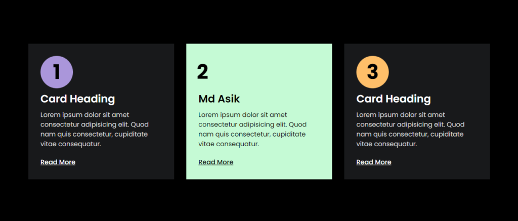
Our HTML layout consists of a simple container with three cards. Each card has a title, description and link.
					<!DOCTYPE html>
<html lang="en">
<head>

    <meta name="viewport" content="width=device-width, initial-scale=1.0">
    <title>MD ASIK - Card Hover Effect</title>
    <link rel="stylesheet" href="style.css">
</head>
<body>
    <section class="section">
        <div class="container">
            <div class="section-cards">
                <div class="section-card">
                    <span>1</span>
                    <h2>card heading</h2>
                    <p>Lorem ipsum dolor sit amet consectetur adipisicing elit. Quod nam quis consectetur, cupiditate vitae consequatur.</p>
                    <a href="#">read more</a>
                </div>
                <div class="section-card">
                    <span>2</span>
                    <h2>Md Asik</h2>
                    <p>Lorem ipsum dolor sit amet consectetur adipisicing elit. Quod nam quis consectetur, cupiditate vitae consequatur.</p>
                    <a href="https://www.instagram.com/gevstack/" target="_blank" rel="noopener">read more</a>
                </div>
                <div class="section-card">
                    <span>3</span>
                    <h2>card heading</h2>
                    <p>Lorem ipsum dolor sit amet consectetur adipisicing elit. Quod nam quis consectetur, cupiditate vitae consequatur.</p>
                    <a href="#">read more</a>
                </div>
            </div>
        </div>
    </section>
<script>class RocketElementorAnimation{constructor(){this.deviceMode=document.createElement("span"),this.deviceMode.id="elementor-device-mode",this.deviceMode.setAttribute("class","elementor-screen-only"),document.body.appendChild(this.deviceMode)}_detectAnimations(){let t=getComputedStyle(this.deviceMode,":after").content.replace(/"/g,"");this.animationSettingKeys=this._listAnimationSettingsKeys(t),document.querySelectorAll(".elementor-invisible[data-settings]").forEach(t=>{const e=t.getBoundingClientRect();if(e.bottom>=0&&e.top<=window.innerHeight)try{this._animateElement(t)}catch(t){}})}_animateElement(t){const e=JSON.parse(t.dataset.settings),i=e._animation_delay||e.animation_delay||0,n=e[this.animationSettingKeys.find(t=>e[t])];if("none"===n)return void t.classList.remove("elementor-invisible");t.classList.remove(n),this.currentAnimation&&t.classList.remove(this.currentAnimation),this.currentAnimation=n;let s=setTimeout(()=>{t.classList.remove("elementor-invisible"),t.classList.add("animated",n),this._removeAnimationSettings(t,e)},i);window.addEventListener("rocket-startLoading",function(){clearTimeout(s)})}_listAnimationSettingsKeys(t="mobile"){const e=[""];switch(t){case"mobile":e.unshift("_mobile");case"tablet":e.unshift("_tablet");case"desktop":e.unshift("_desktop")}const i=[];return["animation","_animation"].forEach(t=>{e.forEach(e=>{i.push(t+e)})}),i}_removeAnimationSettings(t,e){this._listAnimationSettingsKeys().forEach(t=>delete e[t]),t.dataset.settings=JSON.stringify(e)}static run(){const t=new RocketElementorAnimation;requestAnimationFrame(t._detectAnimations.bind(t))}}document.addEventListener("DOMContentLoaded",RocketElementorAnimation.run);</script></body>
</html>
Explanation:
- The HTML structure starts with the
<!DOCTYPE html>declaration, indicating an HTML5 document. <html lang="en">specifies the language as English.<head>contains metadata and links the stylesheetstyle.css.<body>contains the main content of the page within a<section>element.- The section has a class
section, inside which there’s acontainerdiv. - Inside the container, there are three
section-carddivs, each representing a card with a number (<span>), heading (<h2>), description (<p>), and a link (<a>).
CSS Styling
					@import url('https://fonts.googleapis.com/css2?family=Allura&family=Nunito:wght@200;400;500;600;800&family=Poppins:wght@100;200;300;400;500;600;700;800;900&display=swap');
*{
    margin: 0;
    padding: 0;
    box-sizing: border-box;
}
body{
    font-family: 'Poppins', sans-serif;
    background-color: hsl(0, 0%, 0%);
    font-size: 16px;
}
.container{
    max-width: 1170px;
    padding: 0 15px;
    margin: auto;
}
.section{
    padding: 80px 0;
    min-height: 100vh;
    display: flex;
}
.section-cards{
    display: grid;
    grid-template-columns: repeat(3, 1fr);
    gap: 30px;
}
.section-card{
    background-color: hsl(220, 6%, 10%);
    padding: 120px 30px 30px;
    position: relative;
    z-index: 1;
}
.section-card:nth-child(1){
    --color: #AA96DA;
}
.section-card:nth-child(2){
    --color: #C5FAD5;
}
.section-card:nth-child(3){
    --color: #FFBF69;
}
.section-card::before{
    content: '';
    position: absolute;
    left: 0;
    top: 0;
    height: 100%;
    width: 100%;
    background-color: var(--color);
    z-index: -1;
    clip-path: circle(40px at 70px 70px);
    transition: clip-path 1s ease;
}
.section-card:hover::before{
    clip-path: circle(100%);
}
.section-card span{
    position: absolute;
    left: 0;
    top: 0;
    height: 80px;
    width: 80px;
    font-size: 50px;
    font-weight: bold;
    transform: translate(30px, 30px);
    display: flex;
    align-items: center;
    justify-content: center;
    color: hsl(0, 0%, 0%);
    transition: transform 1s ease;
}
.section-card:hover span{
    transform: translate(0, 30px);
}
.section-card h2{
    font-size: 26px;
    color: hsl(0, 0%, 100%);
    font-weight: 600;
    text-transform: capitalize;
    margin-bottom: 10px;
    line-height: 1.3;
}
.section-card p{
    color: hsl(0, 0%, 85%);
    line-height: 1.5;
}
.section-card a{
    display: inline-block;
    text-transform: capitalize;
    color: hsl(0, 0%, 100%);
    margin-top: 20px;
    font-weight: 500;
}
.section-card a,
.section-card h2,
.section-card p{
    transition: color 1s ease;
}
.section-card:hover a,
.section-card:hover h2,
.section-card:hover p{
    color: hsl(0, 0%, 0%);
}
@media(max-width:991px){
    .section-cards{
        grid-template-columns: repeat(2, 1fr);
    }
}
@media(max-width:575px){
    .section-cards{
        grid-template-columns: repeat(1, 1fr);
    }
}
Explanation:
- The
@importrule imports Google Fonts for the page. - The
*selector setsmarginandpaddingto 0 and usesbox-sizing: border-boxto include padding and border in the element’s total width and height. - The
bodyhas a dark background and uses the ‘Poppins’ font. - The
.containerclass sets a max-width and centers the content. - The
.sectionclass adds padding and sets the minimum height and display properties. - The
.section-cardsclass creates a grid layout with three equal columns. - Each
.section-cardhas a dark background, padding, and relative positioning. - The
:nth-childpseudo-class sets different background colors for each card using CSS variables. - The
::beforepseudo-element creates a colored overlay with a circular clip path that transitions on hover. - The
spanelement inside each card is styled to be a large number in the top left and transitions its position on hover. - The
h2,p, andaelements inside each card have their colors and transitions defined. - Media queries adjust the grid layout for different screen sizes, changing to two columns for smaller screens and a single column for the smallest screens.
Click here to download the file
DOWNLoAD NoWYour File will download in 15 seconds...
Video Preview
Conclusion
With a combination of HTML and CSS, we’ve created an interactive card hover effect that enhances the visual appeal of a webpage. This effect can be customized and extended to fit various design needs, making your web content more engaging and dynamic.
I hope this code helps you Creating an Interactive Card Hover Effect with HTML and CSS. If you have any doubts or problem with the code, comment below to find the solutions. Also share this blog if you find this useful.
Want to build professional website for your Business or Store, Get a free quote here
Click here to get Premium Plugins and Themes at rs.249. Get 20% Off on your first order “WELCOME20”