In this blog, we will learn how to create an animation slider using HTML and CSS. An animation slider is a great way to add some interactivity and visual appeal to your website. It can be used to display logos, images, or any other content that you want to slide across the screen.
Table of Contents
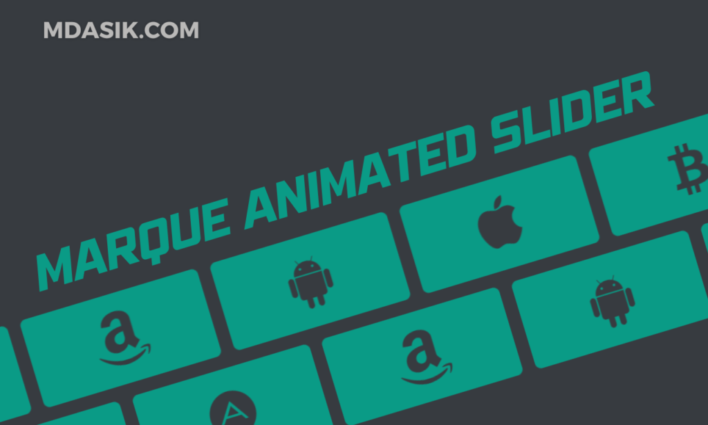
An animation slider is a component that can display a list of items (like images or icons) in a continuously scrolling manner. This can make your website look dynamic and engaging. In this tutorial, we will use HTML and CSS to create a simple animation slider that displays a series of icons.
HTML structure
Let’s start by understanding the HTML structure of our animation slider. Here is the complete HTML code:
					<!DOCTYPE html>
<html>
<head>
	<title></title>
	<link data-minify="1" rel="stylesheet" href="https://mdasik.com/wp-content/cache/min/1/ajax/libs/font-awesome/4.7.0/css/font-awesome.min.css?ver=1752595956">
	<link rel="stylesheet" type="text/css" href="style.css">
</head>
<body>
	<article class="wrapper">
		<div class="marquee">
			<div class="marquee_group">
				<i class="fa fa-adn"></i>
				<i class="fa fa-amazon"></i>
				<i class="fa fa-android"></i>
				<i class="fa fa-apple"></i>
				<i class="fa fa-bitcoin"></i>
				<i class="fa fa-dropbox"></i>
				<i class="fa fa-github"></i>
				<i class="fa fa-html5"></i>
			</div>
			<div aria-hidden="true" class="marquee_group">
				<i class="fa fa-adn"></i>
				<i class="fa fa-amazon"></i>
				<i class="fa fa-android"></i>
				<i class="fa fa-apple"></i>
				<i class="fa fa-bitcoin"></i>
				<i class="fa fa-dropbox"></i>
				<i class="fa fa-github"></i>
				<i class="fa fa-html5"></i>
			</div>
		</div>
		<div class="marquee marquee-reverse">
			<div class="marquee_group">
				<i class="fa fa-adn"></i>
				<i class="fa fa-amazon"></i>
				<i class="fa fa-android"></i>
				<i class="fa fa-apple"></i>
				<i class="fa fa-bitcoin"></i>
				<i class="fa fa-dropbox"></i>
				<i class="fa fa-github"></i>
				<i class="fa fa-html5"></i>
			</div>
			<div aria-hidden="true" class="marquee_group">
				<i class="fa fa-adn"></i>
				<i class="fa fa-amazon"></i>
				<i class="fa fa-android"></i>
				<i class="fa fa-apple"></i>
				<i class="fa fa-bitcoin"></i>
				<i class="fa fa-dropbox"></i>
				<i class="fa fa-github"></i>
				<i class="fa fa-html5"></i>
			</div>
		</div>
	</article>
<script>class RocketElementorAnimation{constructor(){this.deviceMode=document.createElement("span"),this.deviceMode.id="elementor-device-mode",this.deviceMode.setAttribute("class","elementor-screen-only"),document.body.appendChild(this.deviceMode)}_detectAnimations(){let t=getComputedStyle(this.deviceMode,":after").content.replace(/"/g,"");this.animationSettingKeys=this._listAnimationSettingsKeys(t),document.querySelectorAll(".elementor-invisible[data-settings]").forEach(t=>{const e=t.getBoundingClientRect();if(e.bottom>=0&&e.top<=window.innerHeight)try{this._animateElement(t)}catch(t){}})}_animateElement(t){const e=JSON.parse(t.dataset.settings),i=e._animation_delay||e.animation_delay||0,n=e[this.animationSettingKeys.find(t=>e[t])];if("none"===n)return void t.classList.remove("elementor-invisible");t.classList.remove(n),this.currentAnimation&&t.classList.remove(this.currentAnimation),this.currentAnimation=n;let s=setTimeout(()=>{t.classList.remove("elementor-invisible"),t.classList.add("animated",n),this._removeAnimationSettings(t,e)},i);window.addEventListener("rocket-startLoading",function(){clearTimeout(s)})}_listAnimationSettingsKeys(t="mobile"){const e=[""];switch(t){case"mobile":e.unshift("_mobile");case"tablet":e.unshift("_tablet");case"desktop":e.unshift("_desktop")}const i=[];return["animation","_animation"].forEach(t=>{e.forEach(e=>{i.push(t+e)})}),i}_removeAnimationSettings(t,e){this._listAnimationSettingsKeys().forEach(t=>delete e[t]),t.dataset.settings=JSON.stringify(e)}static run(){const t=new RocketElementorAnimation;requestAnimationFrame(t._detectAnimations.bind(t))}}document.addEventListener("DOMContentLoaded",RocketElementorAnimation.run);</script></body>
</html>
Explanation
- HTML Document Structure: The document starts with the
<!DOCTYPE html>declaration, followed by the<html>,<head>, and<body>tags. - Head Section: The
<head>section includes two<link>tags to import the Font Awesome library and an external CSS file namedstyle.css. - Body Section: The
<body>section contains an<article>element with a class ofwrapper. Inside this<article>, there are two<div>elements with a class ofmarqueeandmarquee marquee-reverse. Each of these contains another<div>with a class ofmarquee_groupthat holds a series of<i>tags representing Font Awesome icons.
CSS Styling
Next, let’s look at the CSS code that styles our animation slider:
					:root {
    --color-text: #373b40;
    --colog-bg: #373b40;
    --color-bg-accent: #0a9b86;
    --size: clamp(10rem, 1rem + 40vmin, 30rem);
    --gap: calc(var(--size) / 14);
    --duration: 60s;
    --scroll-start: 0;
    --scroll-end: calc(-100% - var(--gap));
}

* { box-sizing: border-box; }

body {
    display: grid;
    align-content: center;
    overflow: hidden;
    gap: var(--gap);
    width: 100%;
    min-height: 100vh;
    font-family: system-ui, sans-serif;
    font-size: 1rem;
    line-height: 1.5;
    color: var(--color-text);
    background-color: var(--colog-bg);
}

.marquee {
    display: flex;
    overflow: hidden;
    user-select: none;
    gap: var(--gap);
}

.marquee_group {
    flex-shrink: 0;
    display: flex;
    align-items: center;
    justify-content: space-around;
    gap: var(--gap);
    min-width: 100%;
    animation: scroll-x var(--duration) linear infinite;
}

.marquee-reverse .marquee_group {
    animation-direction: reverse;
    animation-delay: -3s;
}

@keyframes scroll-x {
    from { transform: translateX(var(--scroll-start)); }
    to { transform: translateX(var(--scroll-end)); }
}

.fa {
    font-size: 70px !important;
}

.marquee .fa {
    display: grid;
    place-items: center;
    width: var(--size);
    fill: var(--color-text);
    background: var(--color-bg-accent);
    aspect-ratio: 19/9;
    padding: calc(var(--size) / 10);
    border-radius: 0.5rem;
}

.wrapper {
    display: flex;
    flex-direction: column;
    gap: var(--gap);
    margin: auto;
    max-width: 100vw;
}
Explanation
- CSS Variables: The
:rootselector defines several custom properties (variables) for colors, sizes, and animation settings. --color-text: Color of the text.--colog-bg: Background color.--color-bg-accent: Accent background color for the icons.--size: Dynamic size for the icons using theclampfunction.--gap: Gap between the elements, calculated based on the--size.--duration: Duration of the animation.--scroll-startand--scroll-end: Starting and ending positions for the animation.- Universal Selector: The
*selector ensures that thebox-sizingproperty is set toborder-boxfor all elements.
- Body Styling: The
bodyis styled as a grid, centered, with overflow hidden, and various font and color properties. - Marquee Styling: The
.marqueeclass sets up a flex container with hidden overflow and a gap. Inside it,.marquee_groupis also a flex container with a minimum width of 100%, and an animation that makes it scroll horizontally. The.marquee-reverseclass applies a reverse direction and delay to the scrolling animation. - Keyframes Animation: The
@keyframes scroll-xdefines the horizontal scrolling animation from the starting position (--scroll-start) to the ending position (--scroll-end). - Font Awesome Icons: The
.faclass sets the font size for the icons, and.marquee .faapplies additional styling like centering the icons, setting their size, aspect ratio, padding, and background. - Wrapper Styling: The
.wrapperclass arranges the content in a column with a gap between items, centers the content, and sets the maximum width to the viewport width.
Step-by-Step Guide
Let’s break down each part of the code and understand how it works together to create the animation slider.
HTML: Structure and Content
- HTML Document: We start with a basic HTML document structure. The
<head>section includes links to the Font Awesome library for icons and an external CSS file (style.css) for styling. - Wrapper: The main content is wrapped inside an
<article>with the classwrapper. This ensures our content is organized and styled properly. - Marquee Containers: There are two
<div>elements with the classmarquee. Each contains two child<div>elements with the classmarquee_group. This setup is duplicated to create a continuous loop effect for the scrolling animation. - Font Awesome Icons: Inside each
marquee_group, we have several<i>elements with Font Awesome icon classes. These icons will be animated to scroll horizontally.
CSS: Styling and Animation
- CSS Variables: Variables defined in the
:rootselector make it easy to adjust the colors, sizes, and animation properties globally. - Universal Box Sizing: The
*selector setsbox-sizingtoborder-boxfor all elements, ensuring consistent sizing and padding. - Body Styling: The body is set to a grid layout, centered, with hidden overflow. The gap, width, and height ensure the content is properly spaced and fits the screen.
- Marquee Flexbox: The
.marqueeclass uses Flexbox to align its children horizontally. The overflow is hidden to create the scrolling effect. - Marquee Group Animation: The
.marquee_groupclass applies the horizontal scrolling animation using thescroll-xkeyframes. Themarquee-reverseclass reverses the animation direction for a smooth, continuous effect. - Keyframes: The
@keyframes scroll-xdefines the animation to translate themarquee_groupfrom the starting position (--scroll-start) to the ending position (--scroll-end). - Icon Styling: The
.faclass sets the font size, while.marquee .facenters the icons, sets their dimensions, background color, and padding, creating a visually appealing look.
Customization and Usage
This animation slider is highly customizable. You can:
- Change Icons: Replace Font Awesome classes with different icons.
- Adjust Speed: Modify the
--durationvariable to change the animation speed. - Alter Colors: Update color variables for different text and background colors.
- Modify Size: Adjust the
--sizevariable to change the icon size.
Example Usage
This animation slider can be used in various contexts:
- Showcase Brands: Display brand logos in a scrolling manner.
- Highlight Features: Animate icons representing key features of a product.
- Content Slider: Create a slider for images or other content items.
Click here to download the file
DOWNLoAD NoWYour File will download in 15 seconds...
Video Preview
Conclusion
Creating an animation slider with HTML and CSS is a straightforward way to add dynamic visual elements to your website. By understanding the structure and styling, you can customize and extend this example to suit your needs. Whether you’re displaying logos, images, or any other content, an animation slider can make your website more engaging and visually appealing.
I hope this code helps you Creating an Animation Slider with HTML and CSS. If you have any doubts or problem with the code, comment below to find the solutions. Also share this blog if you find this useful.
Want to build professional website for your Business or Store, Get a free quote here
Click here to get Premium Plugins and Themes at rs.249. Get 20% Off on your first order “WELCOME20”