Eye-catching pricing cards are a must-have for any website offering services or products with different tiers. They help visitors quickly understand the value proposition of each option and nudge them towards making a decision[neon pricing cards css]. In this blog post, we’ll create a set of modern pricing cards with a cool neon effect using CSS.
The code we’ll use is straightforward and relies purely on CSS to achieve the visual style. This makes it lightweight and customizable to fit your specific branding.
Table of Contents
HTML structure
The HTML code provides the basic structure for our pricing cards. It includes elements like <header>, <section>, and <article> that would normally define different website sections. However, in this case, we’ll achieve the layout entirely with CSS. Here’s a breakdown of the key HTML elements:
<!DOCTYPE html>
<html lang="en">
<head>
<meta name="viewport" content="width=device-width, initial-scale=1.0">
<title>@mdasik</title>
<link data-minify="1" rel="stylesheet" href="https://mdasik.com/wp-content/cache/min/1/ajax/libs/font-awesome/5.15.3/css/all.min.css?ver=1782752326">
</head>
<body>
<main class="main flow">
<!-- <h1 class="main__heading">Hotel Room Types</h1> -->
<div class="main__cards cards">
<div class="cards__inner">
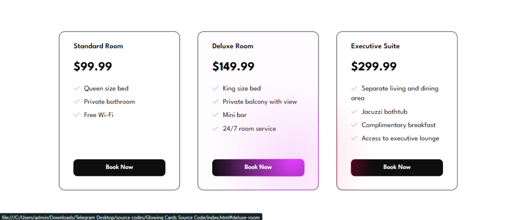
<div class="cards__card card">
<h2 class="card__heading">Standard Room</h2>
<p class="card__price">$99.99</p>
<ul role="list" class="card__bullets flow">
<li>Queen size bed</li>
<li>Private bathroom</li>
<li>Free Wi-Fi</li>
</ul>
<a href="#standard-room" class="card__cta cta">Book Now</a>
</div>
<div class="cards__card card">
<h2 class="card__heading">Deluxe Room</h2>
<p class="card__price">$149.99</p>
<ul role="list" class="card__bullets flow">
<li>King size bed</li>
<li>Private balcony with view</li>
<li>Mini bar</li>
<li>24/7 room service</li>
</ul>
<a href="#deluxe-room" class="card__cta cta">Book Now</a>
</div>
<div class="cards__card card">
<h2 class="card__heading">Executive Suite</h2>
<p class="card__price">$299.99</p>
<ul role="list" class="card__bullets flow">
<li>Separate living and dining area</li>
<li>Jacuzzi bathtub</li>
<li>Complimentary breakfast</li>
<li>Access to executive lounge</li>
</ul>
<a href="#executive-suite" class="card__cta cta">Book Now</a>
</div>
</div>
<div class="overlay cards__inner"></div>
</div>
</main>
<script>class RocketElementorAnimation{constructor(){this.deviceMode=document.createElement("span"),this.deviceMode.id="elementor-device-mode",this.deviceMode.setAttribute("class","elementor-screen-only"),document.body.appendChild(this.deviceMode)}_detectAnimations(){let t=getComputedStyle(this.deviceMode,":after").content.replace(/"/g,"");this.animationSettingKeys=this._listAnimationSettingsKeys(t),document.querySelectorAll(".elementor-invisible[data-settings]").forEach(t=>{const e=t.getBoundingClientRect();if(e.bottom>=0&&e.top<=window.innerHeight)try{this._animateElement(t)}catch(t){}})}_animateElement(t){const e=JSON.parse(t.dataset.settings),i=e._animation_delay||e.animation_delay||0,n=e[this.animationSettingKeys.find(t=>e[t])];if("none"===n)return void t.classList.remove("elementor-invisible");t.classList.remove(n),this.currentAnimation&&t.classList.remove(this.currentAnimation),this.currentAnimation=n;let s=setTimeout(()=>{t.classList.remove("elementor-invisible"),t.classList.add("animated",n),this._removeAnimationSettings(t,e)},i);window.addEventListener("rocket-startLoading",function(){clearTimeout(s)})}_listAnimationSettingsKeys(t="mobile"){const e=[""];switch(t){case"mobile":e.unshift("_mobile");case"tablet":e.unshift("_tablet");case"desktop":e.unshift("_desktop")}const i=[];return["animation","_animation"].forEach(t=>{e.forEach(e=>{i.push(t+e)})}),i}_removeAnimationSettings(t,e){this._listAnimationSettingsKeys().forEach(t=>delete e[t]),t.dataset.settings=JSON.stringify(e)}static run(){const t=new RocketElementorAnimation;requestAnimationFrame(t._detectAnimations.bind(t))}}document.addEventListener("DOMContentLoaded",RocketElementorAnimation.run);</script></body>
</html>
Explanation:
<!DOCTYPE html>: This line declares the document type as HTML.<html>: This tag is the root element of the HTML document.<head>: This section contains meta information about the document, including the title and stylesheet link.<body>: This section contains the visible content of the webpage, including our pricing cards.<main>: This element groups the main content of our webpage, which in this case will be the pricing cards..card: This class defines the styles for each individual pricing card.
CSS Styling
The CSS code is where the magic happens! Let’s break down the CSS step-by-step:
					<style>
    @import url("https://fonts.googleapis.com/css2?family=League+Spartan:wght@400;500;600;700;800;900&display=swap");

    *,
    *::after,
    *::before {
      box-sizing: border-box;
      margin: 0;
      padding: 0;
    }

    html,
    body {
      height: 100%;
      min-height: 100vh;
    }

    body {
      display: grid;
      place-items: center;
      font-family: "League Spartan", system-ui, sans-serif;
      font-size: 1.1rem;
      line-height: 1.2;
      background-color: #fff;
      color: #000;
    }

    ul {
      list-style: none;
    }

    .main {
      max-width: 75rem;
      padding: 3em 1.5em;
    }

    .main__heading {
      font-weight: 600;
      font-size: 2.25em;
      margin-bottom: 0.75em;
      text-align: center;
      color: #000;
    }

    .cards {
      position: relative;
    }

    .cards__inner {
      display: flex;
      flex-wrap: wrap;
      gap: 2.5em;
      width: 100%;
    }

    .card {
      --flow-space: 0.5em;
      --hsl: var(--hue), var(--saturation), var(--lightness);
      flex: 1 1 14rem;
      width: 300px;
      padding: 1.5em 2em;
      display: grid;
      grid-template-rows: auto auto auto 1fr;
      align-items: start;
      gap: 1.25em;
      color: #000;
      background-color: transparent;
      border: 1px solid #000;
      border-radius: 15px;
    }

    .card:nth-child(1) {
      --hue: 165;
      --saturation: 82.26%;
      --lightness: 51.37%;
    }

    .card:nth-child(2) {
      --hue: 291.34;
      --saturation: 95.9%;
      --lightness: 61.76%;
    }

    .card:nth-child(3) {
      --hue: 338.69;
      --saturation: 100%;
      --lightness: 48.04%;
    }

    .card__bullets {
      line-height: 1.4;
    }

    .card__bullets li::before {
      display: inline-block;
      color: #000;
      content: url("data:image/svg+xml,%3Csvg xmlns='http://www.w3.org/2000/svg' viewBox='0 0 512 512'  width='16' title='check' fill='%23dddddd'%3E%3Cpath d='M173.898 439.404l-166.4-166.4c-9.997-9.997-9.997-26.206 0-36.204l36.203-36.204c9.997-9.998 26.207-9.998 36.204 0L192 312.69 432.095 72.596c9.997-9.997 26.207-9.997 36.204 0l36.203 36.204c9.997 9.997 9.997 26.206 0 36.204l-294.4 294.401c-9.998 9.997-26.207 9.997-36.204-.001z' /%3E%3C/svg%3E");
      transform: translatey(0.25ch);
      margin-right: 1ch;
    }

    .card__heading {
      font-size: 1.05em;
      font-weight: 600;
    }

    .card__price {
      font-size: 1.75em;
      font-weight: 700;
    }

    .flow>*+* {
      margin-top: var(--flow-space, 1.25em);
    }

    .cta {
      display: block;
      align-self: end;
      margin: 1em 0 0.5em 0;
      text-align: center;
      text-decoration: none;
      color: #fff;
      background-color: #0d0d0d;
      padding: 0.7em;
      border-radius: 10px;
      font-size: 1rem;
      font-weight: 600;
    }

    .overlay {
      position: absolute;
      inset: 0;
      pointer-events: none;
      user-select: none;
      opacity: var(--opacity, 0);
      -webkit-mask: radial-gradient(25rem 25rem at var(--x) var(--y),
          #000 1%,
          transparent 50%);
      mask: radial-gradient(25rem 25rem at var(--x) var(--y),
          #000 1%,
          transparent 50%);
      transition: 400ms mask ease;
      will-change: mask;
    }

    .overlay .card {
      background-color: hsla(var(--hsl), 0.15);
      border-color: hsla(var(--hsl), 1);
      box-shadow: 0 0 0 1px inset hsl(var(--hsl));
    }

    .overlay .cta {
      display: block;
      grid-row: -1;
      width: 100%;
      background-color: hsl(var(--hsl));
      box-shadow: 0 0 0 1px hsl(var(--hsl));
    }

    :not(.overlay)>.card {
      transition: 400ms background ease;
      will-change: background;
    }

    :not(.overlay)>.card:hover {
      --lightness: 95%;
      background: hsla(var(--hsl), 0.1);
    }

  </style>
Explanation:
Resetting Styles and Basic Setup:
* { box-sizing: border-box; margin: 0; padding: 0; }: This line resets default browser margins and paddings for all elements, ensuring consistent layout across browsers.body { display: grid; place-items: center; }: These properties define the overall layout of the webpage. Thegriddisplay allows for flexible positioning of elements, andplace-items: centercenters the content horizontally and vertically.
Defining the Main Container and Cards:
.main { max-width: 75rem; padding: 3em 1.5em; }: This creates a container for the pricing cards with a maximum width of 75rem (750px) and some padding around the edges..cards { position: relative; }: This sets the position of the cards container torelative, which is important for creating the hover effect later..cards__inner { display: flex; flex-wrap: wrap; gap: 2.5em; }: This defines how the individual cards are positioned within the container. It uses flexbox properties to display the cards in a row, wrapping them to the next line if needed, and maintains a gap of 2.5em between each card..card { flex: 1 1 14rem; width: 300px; }: This sets the width and sizing properties for each card.
Adding Text and Content:
.card__heading { font-size: 1.05em; font-weight: 600; }: This styles the heading text within each card, setting the font size and weight..card__price { font-size: 1.75em; font-weight: 700; }: This styles the price text within each card, making it larger and bolder for better visibility..card__bullets { line-height: 1.4; }: This sets the line height for the bullet points listing the features of each plan, improving readability..card__bullets li::before { content: url("data:image/svg+xml,..."); }: This line adds a checkmark icon using an inline SVG image before each bullet point.
Creating the Neon Effect (Continued):
.overlay { position: absolute; inset: 0; }: This positions the overlay element absolutely within the cards container, covering the entire area..overlay .card { background-color: hsla(var(--hsl), 0.15); }: This line sets the background color of the card within the overlay to a darker shade of the base neon color defined earlier.- The following lines style various elements within the overlay, including the card itself, the call-to-action button, and the box-shadow to create the glowing neon effect.
Adding Hover Interaction:
:not(.overlay)>.card { transition: 400ms background ease; }: This line applies a smooth transition effect to the background color of the cards when hovering over them.:not(.overlay)>.card:hover { --lightness: 95%; }: This code defines what happens when hovering over a card. It increases the lightness value in the HSL color definition, making the card appear brighter.
JavaScript
The provided code also includes some JavaScript to enhance the user experience with the pricing cards. Here’s a simplified explanation of what it does:
- It selects the necessary elements from the HTML document, including the cards container, individual cards, and the overlay element.
- It creates a function to apply the overlay effect when the user moves their mouse over the cards container area. This function calculates the mouse position relative to the container and sets the corresponding properties for the overlay element to create a visually appealing radial gradient effect.
- It creates another function to create a duplicate call-to-action button within each card’s overlay counterpart. This ensures the button remains visible and clickable even when the hover effect is active.
- Finally, it sets up a ResizeObserver to monitor the size changes of each card element. This is necessary to ensure the corresponding overlay card maintains the same dimensions, preventing any visual glitches.
					<script>
    console.clear();

    const cardsContainer = document.querySelector(".cards");
    const cardsContainerInner = document.querySelector(".cards__inner");
    const cards = Array.from(document.querySelectorAll(".card"));
    const overlay = document.querySelector(".overlay");

    const applyOverlayMask = (e) => {
      const overlayEl = e.currentTarget;
      const x = e.pageX - cardsContainer.offsetLeft;
      const y = e.pageY - cardsContainer.offsetTop;

      overlayEl.style = `--opacity: 1; --x: ${x}px; --y:${y}px;`;
    };

    const createOverlayCta = (overlayCard, ctaEl) => {
      const overlayCta = document.createElement("div");
      overlayCta.classList.add("cta");
      overlayCta.textContent = ctaEl.textContent;
      overlayCta.setAttribute("aria-hidden", true);
      overlayCard.append(overlayCta);
    };

    const observer = new ResizeObserver((entries) => {
      entries.forEach((entry) => {
        const cardIndex = cards.indexOf(entry.target);
        let width = entry.borderBoxSize[0].inlineSize;
        let height = entry.borderBoxSize[0].blockSize;

        if (cardIndex >= 0) {
          overlay.children[cardIndex].style.width = `${width}px`;
          overlay.children[cardIndex].style.height = `${height}px`;
        }
      });
    });

    const initOverlayCard = (cardEl) => {
      const overlayCard = document.createElement("div");
      overlayCard.classList.add("card");
      createOverlayCta(overlayCard, cardEl.lastElementChild);
      overlay.append(overlayCard);
      observer.observe(cardEl);
    };

    cards.forEach(initOverlayCard);
    document.body.addEventListener("pointermove", applyOverlayMask);

  </script>
Click here to download the file
DOWNLoAD NoWYour File will download in 15 seconds...
Video Preview
Conclusion
By combining HTML, CSS, and a touch of JavaScript, we’ve created a set of modern and interactive pricing cards with a cool neon effect. This code provides a solid foundation that you can customize further to match your brand identity and website design. Play around with the HSL color values to create different neon hues, adjust the font styles and content to match your offerings, and explore additional CSS animations to make your pricing cards even more visually engaging!
I hope this code helps you Create an Neon Pricing Card Hover Effect with HTML and CSS. If you have any doubts or problem with the code, comment below to find the solutions. Also share this blog if you find this useful.
Want to build professional website for your Business or Store, Get a free quote here
Click here to get Premium Plugins and Themes at rs.249. Get 20% Off on your first order “WELCOME20”